Did you know these designer secrets about numbers and letters?
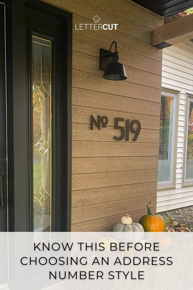
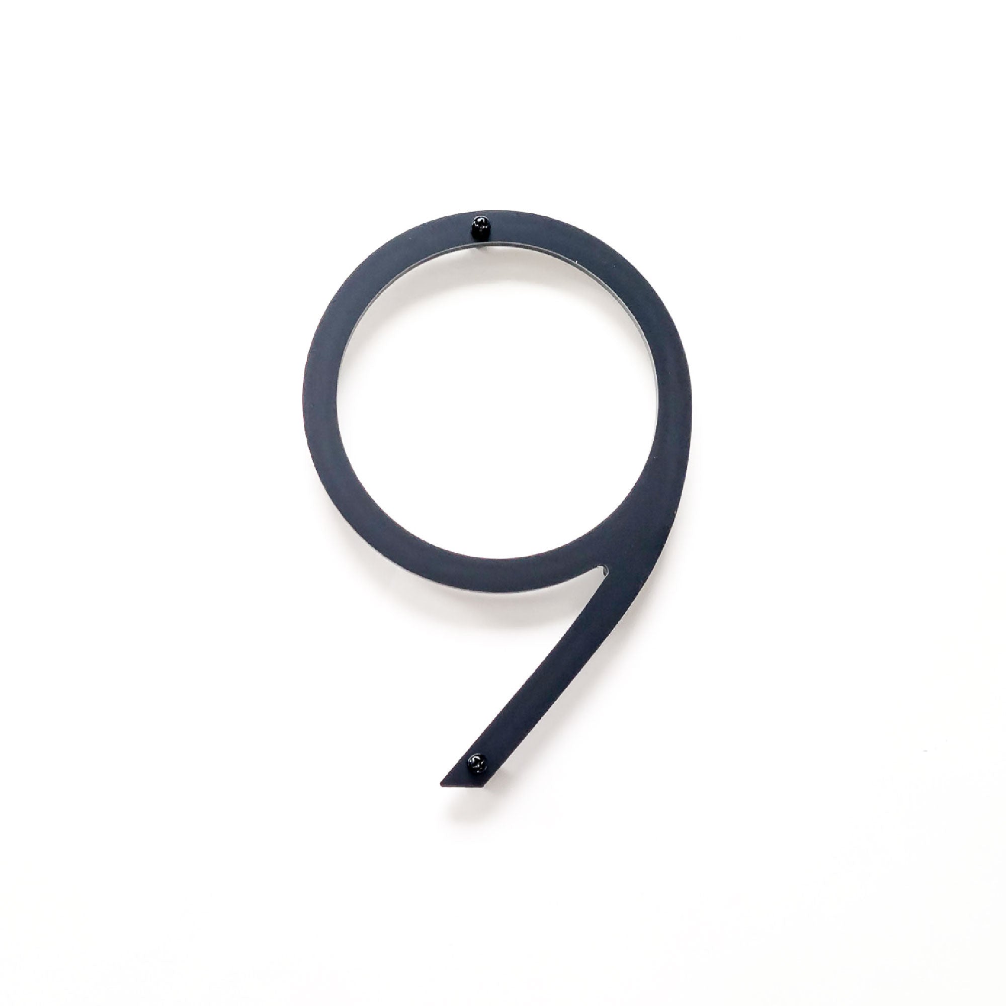
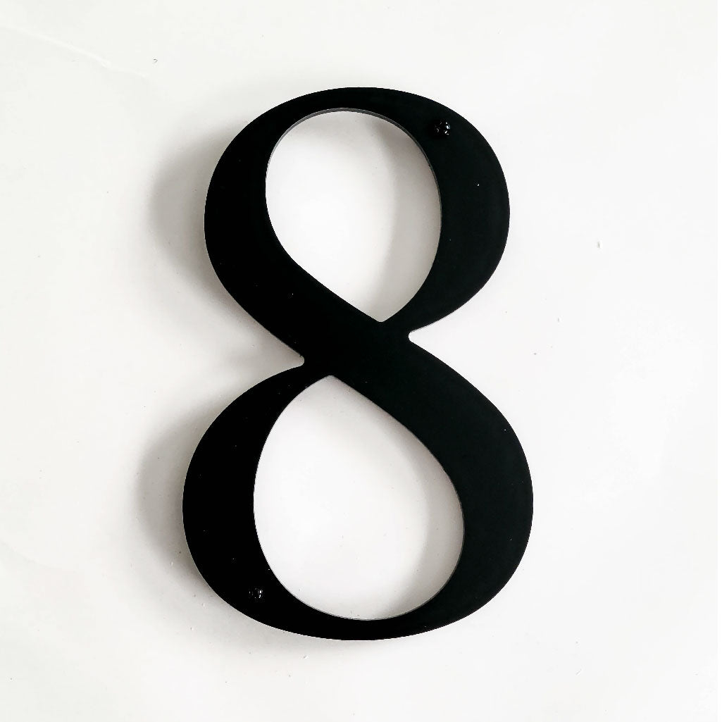
Our most popular style - the THIN MODERN numbers and letters have more difference in width and height between each digit than any of our other address number collections. These differences give this collection a more flamboyant and edgy modern style. Obviously a lot of our customers really like this about the THIN MODERN collection or it wouldn't be the most popular design.
Here is why numbers and letters have different sizes.
Numbers and letters are designed to be appealing to the eye. Most of the time we read letters and numbers on a horizontal line like this paragraph and we don’t notice the differences between the individual letters.
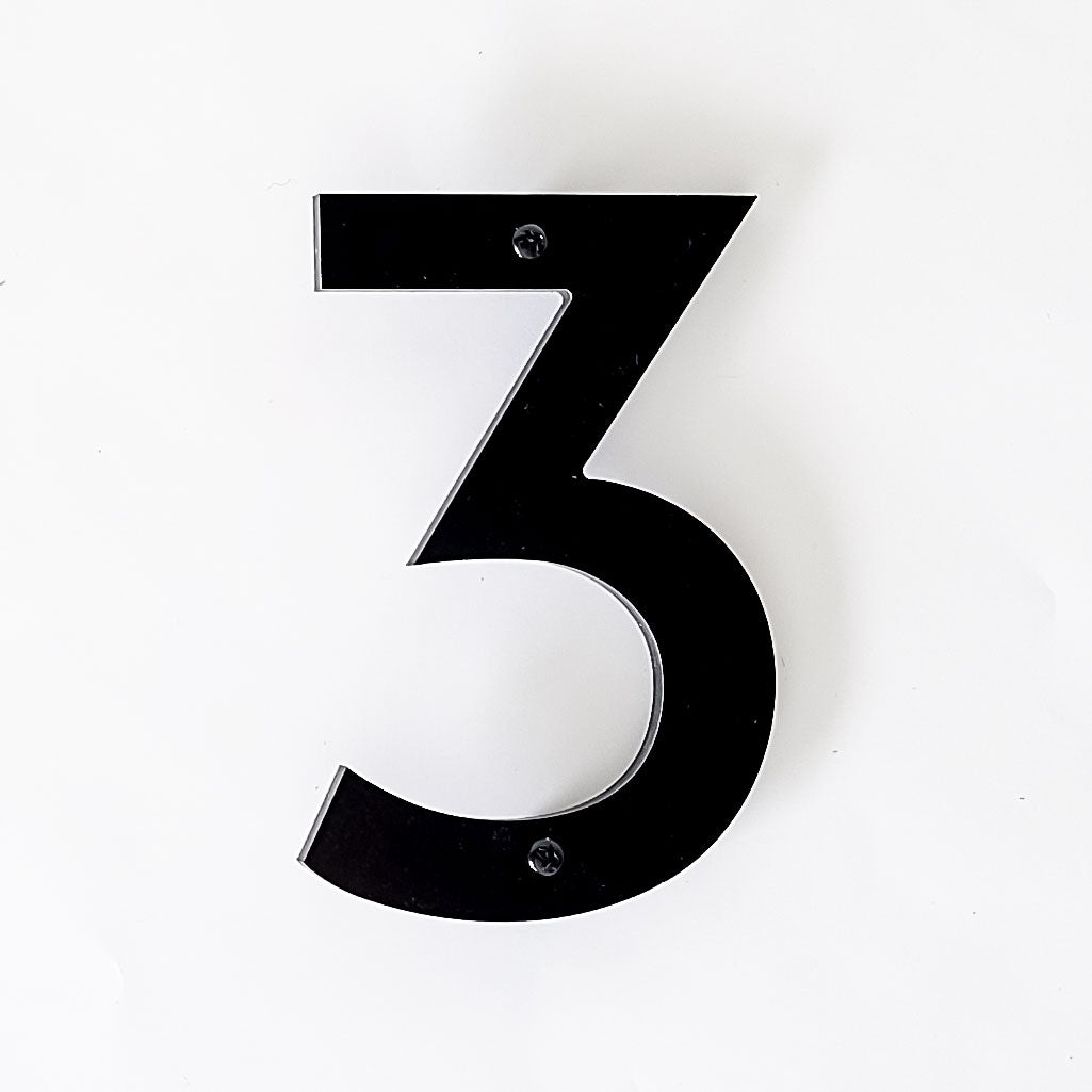
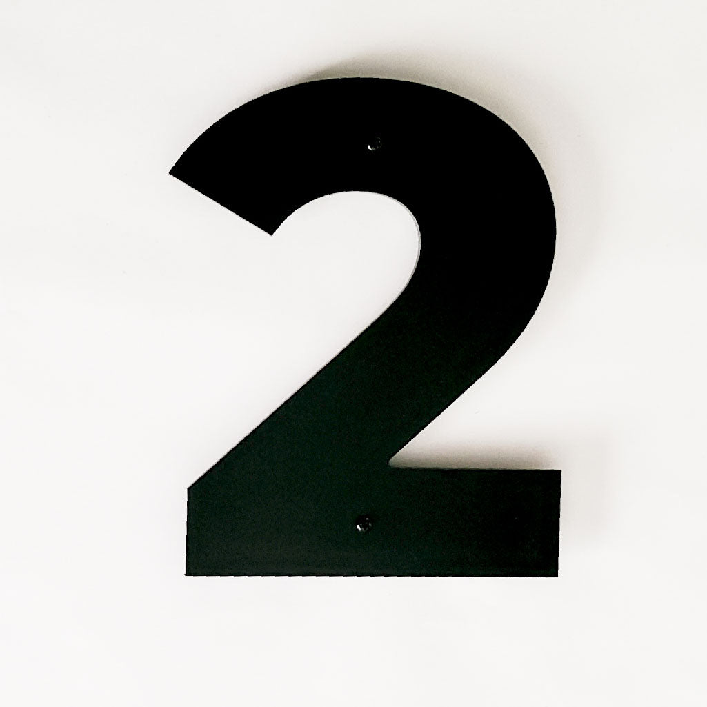
These variations in width have a very different effect when the numbers are vertical. You will see in the following photo that the THIN MODERN 4 is narrower than the 6. You will also see that the CLASSIC MODERN numbers have a very uniform width.

So while we are definitely keeping the THIN MODERN style for our customers who love this collection - we did look for another style that was much more uniform. This is why we added the CLASSIC MODERN style to our address collection.

These size differences continue with the letters. The following photo is an example of this. The THIN MODERN capital letter O is much wider than the other letters. There is still a small variation in the width of CLASSIC MODERN letters because the letters W or O will always be wider than a capital I or T.

Don't be surprised.
We want you to be informed and know what you are getting before you complete your purchase. Download the free templates so you can see exactly what the letters and numbers are like. Print out each collection to compare side by side if you are not sure which one you like. Get your template here.
One more detail that may influence your decision.
The slim style of THIN MODERN – which is very eye-catching – can be hard to read on brick and textured siding. The CLASSIC MODERN numbers are slightly wider by design and don't disappear as easily.

Choose what is right for your location.
We aren't trying to tell you that you should only buy one style or that a certain collection is the best. Each style has their own unique detail and we want you to be able to make an informed decision about what is right for you.
Shop the THIN MODERN collection
Shop the CLASSIC MODERN collection
